

The Friday Face-Off is a new meme created by Books by Proxy, where the idea is to compare the UK and US covers of a book with each week being a certain theme, this week’s theme is a cover which features gold.
For the theme this week I have chosen Sharp Ends by Joe Abercrombie. I had to as I’m a huge Abercrombie fan and the UK cover is just stunning!
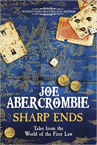
UK Cover:
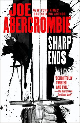
US Cover:
The Winner: UK:
It really was an easy decision for me this week, no doubt about it, the UK takes it hands down, a truly stunning cover! 🙂
Thoughts?? Agree?? Disagree??

Yep. The U.K. one kills it.
LikeLiked by 1 person
I thought both of them were fantastic but I would have to agree with your choice. It also keeps to a similar design to his previous releases and they always look great! 😃👍
LikeLiked by 1 person
Totally agree!
LikeLiked by 1 person
Oh, absolutely – the UK cover has nailed it:). And a really good choice for this week. And SO FAR no one has chosen the same book! Have a great week-end, Drew.
LikeLiked by 1 person
I think no matter what the face-off theme Abercrombie UK covers would win, there’s just something about them that looks stunning.
It’s a miracle, no one’s chosen the same, me thinks that may well happen next week though with the theme being fool/jester as for me there’s only one fool in fantasy and that’s Robin Hobb’s. 😊
LikeLiked by 1 person
Ah! But I’ve managed to find another…:)
LikeLiked by 1 person
Ah, splendid, the easy option for me then and I shall wait with eager anticipation for your Friday Face-Off. 🙂
LikeLike
That UK cover is gorgeous! 😍
LikeLiked by 1 person
It really is, the blue and gold go so well together, all Abercrombie UK covers follow a similar theme and are great. 🙂
LikeLiked by 1 person
I prefer the UK cover too. 🙂
LikeLiked by 1 person
Definitely the UK one! It makes me want to read the book – the US one doesn’t But I wonder which one best reflects the actual book…?
LikeLiked by 1 person
Well it’s a collection of short stories set in the First Law world so I’d say the cover with the map of the First Law world on it. 🙂 I’m not sure what the US covers for other Abercrombie books look like but the UK one though it has a different colour scheme matches the cover designs of his other UK books.
LikeLiked by 1 person
Totally agree! UK one is beautiful.
LikeLiked by 1 person
I really like the UK Abercrombie covers so completely agree with your choice too.
Lynn 😀
LikeLiked by 1 person
There’s just something about his UK covers that really appeals to me, they stand out and look really smart, I think Red County is still my favourite but Sharp Ends is a close second. 😊
LikeLike
I totally agree! I probably wouldn’t read the book with the US cover, but I would the UK. Marketing and design work.
LikeLiked by 1 person
The UK cover actually looks real to me. Like, some took a photo of a blue map with the gold, and them photoshopped the words on top.
LikeLiked by 1 person
Agree! The US cover doesn’t have near the same amount of personality.
LikeLiked by 1 person
I’m stumped. I like them both.
LikeLike
What the hell is that awful cover? I’m so embarrassed for my country right now. 🙈 Box of shame. 😂 Haha! Definitely the UK cover. Seriously, US, what’s going on with these covers? I’ve seen a lot of bad ones lately. Or I’ll see a really cool one I want, and I go on Amazon and ours is hideous. Makes the decision to go with Kindle over hardback so much easier.
LikeLiked by 1 person
You picked the right one, brother.
LikeLiked by 1 person