

The Friday Face-Off is a new meme created by Books by Proxy, where the idea is to compare the UK and US covers of a book with each week being a certain theme, this week’s theme is a cover featuring a character wearing a cowl or hood – Shrouded in black, in morals I do lack! Chosen in Proxyfish’s absence by myself, yes, I was let loose on the blogging world to choose something!
Now, there are countless cowled/hooded characters found in fantasy who dare I say can most often be found to be somewhat lacking morals. But for me, when choosing this theme there was only one I had in mind. A happy, nice, polite, well-mannered, courteous and gentlemanly young man by the name of Jorg Ancrath from one of my favourite books Prince of Thorns by one of my favourite authors Mark Lawrence. It is his debut book and is a truly great read for any fantasy fan out there, I would tell you to go and check it out but if you’re a fantasy fan then you should already have read it!
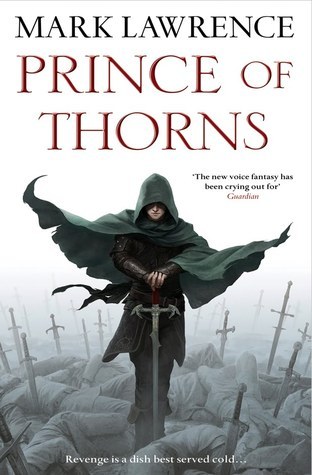
Cover A:
Cover B:

Cover C:
Cover D:

Cover E:
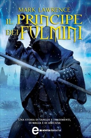

Cover C:
I really like the red colouring of this cover as I feel it sets the dark and ominous tone for the book and also, my eye was drawn to the sword that Jorg is holding. being a fantasy fan I occasionally think while reading, damn, that sounds a cool weapon and alas, that’s what I thought when I saw that sword, damn that looks cool I wish I had one! 🙂
Thoughts?? Agree?? Disagree??
Follow me on:
Twitter and Goodreads.

What an excellent choice of book, Drew:)). Though this week, I disagree with your decision – I far prefer the first cover. I don’t like the fact that below the waist, the protagonist disappears and there is a battleground. I think it looks oddly wrong, notwithstanding I take your point about the ominious mood the red tint effectively depicts. The battleground with the dead bodies is an attention-grabber – and I love the way the cloak billows with the breeze, giving the cover movement and energy.
LikeLiked by 1 person
Ah, you have a point about the first cover, well first two covers but I’d have picked Cover B if I hadn’t picked C. B is exactly the same as A apart from the colour scheme but I preferred the darker grey so we’d have still disagreed. 😊 I think I’ve seen those covers so much though and they are what I associate with Jorg, that when I saw the other one it just really caught my eye. Think that’s one of the great things about the face-off post though, coming across different covers for books you haven’t read but also finding different covers for some of your favourite books you’ve never seen before. 😊
LikeLike
I have cover A on my Kindle, but I like cover B better. The red is nice. Still, I’m going with B. 😎 It’s funny that when I read what you wrote about a hood I thought oh wait I own a book like this. Haha! And you’re the reason I bought it. 😊
LikeLiked by 1 person
Ha, yeah, this was always going to be the book for the cowl theme! 😊
LikeLiked by 1 person
I still have to read it. I need to see why you love it so much. 😊
LikeLiked by 1 person
Cos Jorg is evil incarnate and is awesome!
LikeLiked by 1 person
Sounds about right. 😂
LikeLiked by 1 person
DEFINITELY COVER C (Caps intended)
LikeLiked by 1 person
I was a fan of Cover B, myself. But I loved just looking at all the different covers and depictions. That was really awesome. Also, your description of Jorg had me cracking up. I need to read the second and third books in the series!
LikeLiked by 1 person
Thanks, I like to try and be a bit different on my blog so thought Jorg deserved a different description than normal. 😂
LikeLiked by 1 person
I love the first cover because it’s the book that I own but – Cover D – oh yes!
Lynn 😀
LikeLiked by 1 person
Yeah, that’s the cover I own to. 😊
LikeLike
Love your pick of the winner! It’s one I haven’t seen before 🙂
LikeLiked by 1 person
Woohoo, your the only person to agree with me, glad I’m not the only one who likes it best and it’s a cover I hadn’t seen before either. 🙂
LikeLike
I agree – the red stands out more and is more appealing.
LikeLiked by 1 person
I’ve not seen Cover C before! I’m kind of jealous that some of the foreign editions have such gorgeous cover art. I like both B & C though.
LikeLiked by 1 person
I hadn’t seen cover C before either. Totally agree, since I started joining in with the face-off and coming across covers from foreign countries I keep thinking I wish I owned that cover! 😀
LikeLike
I personally like Cover B and Cover D more , but then again I am a fantasy fan and I haven’t read this book (on my TBR for a long while now) so what do I know
LikeLiked by 1 person
I agree with you about the red cover but I love cover A. The white background hints at mist or fog and gives an eerie feel to it with all those bodies.
LikeLiked by 1 person