The Friday Face-Off is a new meme created by Books by Proxy, where the idea is to compare the UK and US covers of a book with each week being a certain theme, this week’s theme is: Wee, sleekit, cow’rin, timorous beastie – A cover with a beast or beasts.
For the theme this week I have chosen: The Eye of The World (The Wheel of Time Book 1) by Robert Jordan.
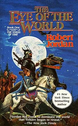
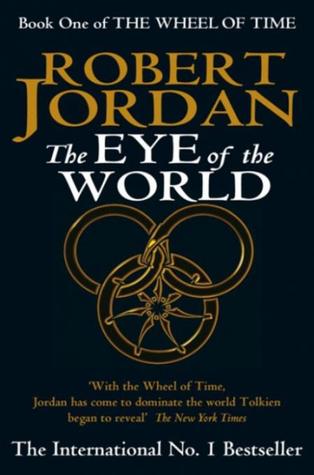
Cover A:
Cover B:
Cover C:

Cover D:
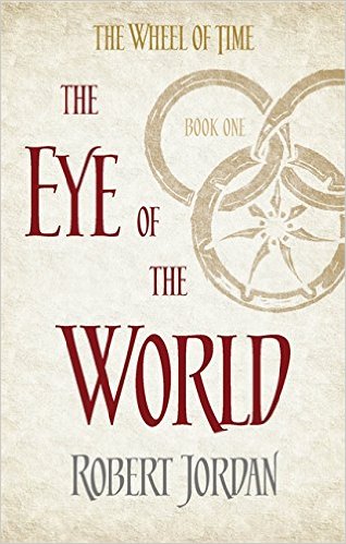
Cover E:
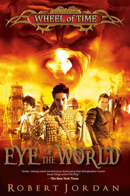
Cover F:
Cover G:


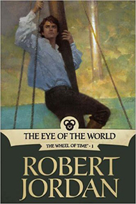
Cover E:
I really like the art direction on this cover. The lighter tones make for a great looking cover along with the red coloured writing and font style, it’s simple but stunning.
Thoughts??Agree?? Disagree??
Why not join in:
Next weeks theme: 30th September: This solitary tree! A living thing – a cover with a tree or trees.
Follow me on:

I completely agree! The cover you chose is simple yet it catches your attention. It makes me wonder what’s inside. With covers like this, I feel like the publisher is saying “what’s inside the book will carry the sales so we don’t need to be flashy.” I love it! 🙂
LikeLiked by 1 person
Definitely agree and simple is sometimes alot better.😀
LikeLiked by 1 person
I’m gonna go with Cover D , coz that’s the one i have 😉
Yeah your choice is the best looking one , but Cover D has the advantage of having an awesome owner like me XD
LikeLiked by 1 person
Cover D was my runner up, the other covers suffer from early 90’s fantasy book cover syndrome with people and animals. 😂
LikeLiked by 1 person
Haha glad they managed to treat that syndrome with “classy modern day cover” symptoms
LikeLiked by 1 person
Damn right. 😂
LikeLiked by 1 person
I like that cover, and the more understated, UK-style covers in general. But the original, US The Eye of the World cover was what sold me on the series, and it is my second favorite of all the original covers – https://everydayshouldbetuesday.wordpress.com/2015/11/17/ranking-original-wheel-of-time-covers/
LikeLiked by 1 person
This book has some pretty bad covers, but I think I’ll have to agree with you on your choice. Have you read this book? One of the rant reviews I received from the Orang-utan Librarian was for this book. 😂
LikeLiked by 1 person
I’ve got the book to read and it’s got the cover I picked as the winner.
I think the older covers as I mentioned to Rash suffer from the early 90’s syndrome of fantasy covers with people on horses, blah! 😂
LikeLiked by 1 person
I guess we’re in for another rant if you have the same feelings about the book as Orang-utan. 😂
LikeLiked by 1 person
Ha, if and when I finally get around to it! 😂
LikeLiked by 1 person
These covers are very 90s lol! I have to agree with you though, the one you picked is the best one. I also went on goodreads to read the synopsis and I can see the cover you chose working hand in hand.
LikeLiked by 1 person
Lots of fantasy covers from the early 90’s all seem to have that same cheesy look about them, sigh, that wouldn’t sell nowadays! 😂
LikeLiked by 1 person
Definitely wouldn’t!!! Lol!
LikeLiked by 1 person
Ha, definitely wouldn’t for me anyway, the book I’m currently reading even has a skull on the cover, yay for darkness! 😂
LikeLiked by 1 person
Lol what year is that one from?
LikeLiked by 1 person
It’s new, 2016 – it’s not out for another couple of weeks. 😂
I don’t actually own any cheesy early 90’s cover fantasy books, it’s just something I picked up from finding covers for the face-off posts that lots all have a very similar cheesy vibe to them.
LikeLiked by 1 person
gotcha!!! they definitely do have cheesy vibes to them. I wouldn’t pick up cheesy covered books =x
LikeLiked by 1 person
So, just so you know, I’ve nominated you for the Blogger Recognition Award, cause I like your blog. So you can check it out https://bisforbatman.wordpress.com/2016/09/23/the-blogger-recognition-award-bitches/. Okay bye x
LikeLiked by 1 person
Cool, thanks. 😀
LikeLiked by 1 person
None of these are really eye-catching to be honest. I of course have cover A. I suppose D & E are the least cheesiest though. Over all, they could have done much better with these.
LikeLiked by 1 person
Ha, the early 90’s cheesefest cover! 😂 Have you read the book, is it worth reading?
LikeLiked by 1 person
I have honestly not started the series. They were gifted to me at the same time I decided to pick up Song of Ice and Fire. Both were daunting reads. I will try to soon though I hope!
LikeLiked by 1 person
I like A, E, and F.
LikeLike
Agree 100%! I’ve always liked simple covers with simple fonts.
LikeLiked by 1 person
I knew you’d pick E the second I saw it! 😀 Same one here though. The first is the most popular around I believe, but jeez Louise, it’s old!
LikeLiked by 1 person
That was my choice as well 😊
LikeLiked by 1 person
I agree but I also like D. I love seeing this meme so much 😀
LikeLiked by 1 person
My favorites would have to be covers D and E. I usually don’t really like covers with people on them, and all the other covers are too busy.
LikeLiked by 1 person
Yeah, they all seem to suffer from early 90’s fantasy cover syndrome with busy covers with people on. 😂
LikeLiked by 1 person
Yeah I own a series of fantasy novels I got from a garage sale last week and they all resemble cover C in one form or another, but I got the entire series (5 books) for $1.50, so it was a good deal.
LikeLiked by 1 person
Cool, that’s cheap, what’s the fantasy series called?
LikeLiked by 1 person
The Belgariad series
LikeLiked by 1 person
I’ve never read but heard some good things. 😀
LikeLiked by 1 person
Cover E is my favourite too (though I own cover A). I think E is the only one that might actually inspire me to pick up the book in store or click on it online (if I didn’t already know the title and author). Many of the other covers would scare me off more than entice me!
LikeLiked by 1 person
Cover E is the one I own, I believe it’s the newest cover, for the UK anyway. Have you read the book? 😀
LikeLike
Yes I’ve read the book, not the rest of the series though. It felt a little too derivative of Lord of the Rings to me so I didn’t continue… but I’ve heard that it gets better/different in subsequent books so am considering giving it another go (I have a friend who loves it and tells me I should keep going!).
LikeLiked by 1 person
Ah, I’ve got the first book, may have to give it a go at some point but it’s such a huge series.
LikeLiked by 1 person
Yes that’s probably the other reason I haven’t continued – at 14 books it’s so huge it’s intimidating!
LikeLiked by 1 person
Agree with your choice. I own the first cover in your list and it is good too.
LikeLiked by 1 person
I definitely agree with your choice! I also like Cover D… the more simple covers appeal to me 😀
LikeLiked by 1 person
It’s the cover A for me. I’m not a fan of the illustration, but I like it when the cover art refers strongly to the story.
LikeLiked by 1 person
I haven’t read the book so didn’t know that, have you read it? Is it any good?
LikeLike
I’ve read it and I enjoyed the first two books but it’s a long-ass series. I’m up to the 5th or 6th book now. It’s good but Jordan tends to write too damn much sometimes.
LikeLiked by 1 person
Yeah, I know there’s 15 in the series, there massive tomes and Sanderson who I don’t particularly like finished it off, all points against me starting it though I do have the first book. 😂
LikeLike
Lol, well, if you’re not bothered by leaving series unfinished, you could give that first book a try.
LikeLiked by 1 person
Ha, I’ve read Game of Thrones, who knows if that will ever be finished so I guess I don’t mind leaving series unfinished.😂
LikeLiked by 1 person
Yes, despite the absence of any beasties – I have to say that I agree with your cover choice. It is far classier and slick than the other offerings:)
LikeLiked by 1 person
I actually like Cover A. It reminds me of the art on Madeline L’Engle’s books. It’s dated, but it’s pretty (to me).
Lots to choose from though!!
LikeLiked by 1 person