
The Friday Face-Off is a new meme created by Books by Proxy, where the idea is to compare the UK and US covers of a book with each week being a certain theme, this week’s theme is: “the sun did not shine, it was to wet too play, so we sat in the house, all that cold, cold wet day” – a cover featuring stormy weather
For the theme this week I have chosen: When The Heavens Fall by Marc Turner. I maybe pushing the boundaries of the theme but it’s one of my favourite books and no-one said it had to be realistic stormy weather! 🙂
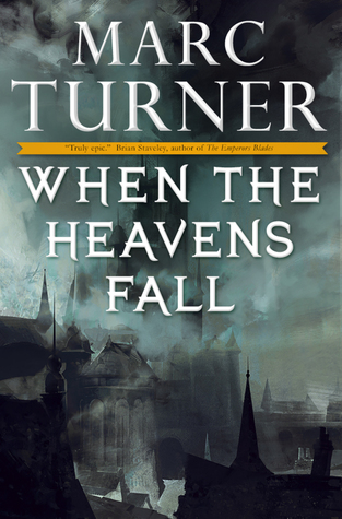
Cover A:
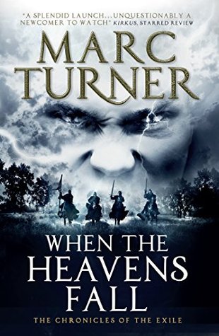
Cover B:
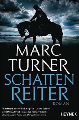
Cover C:
Cover B:
In short, a stunning cover!
Thoughts?? Agree?? Disagree??
Follow me on:
Twitter and Goodreads.

Hmm, I agree. That cover certainly stands out, but I also like the first one because really reflects the theme.
LikeLiked by 1 person
The first cover definitely reflects the face-off theme but cover B reflects the book itself better so I had to pick that one.😀
LikeLike
I like all the covers but I like A the most.. the face on B freaks me out haha!
LikeLiked by 1 person
Lol.😂
LikeLiked by 1 person
Cover A looks quite eerie and then Cover B…well the face in the background ruins it. The simplicity in Cover C is nice, I think it gives more a sense of a storm brewing. C is my favourite!
LikeLiked by 1 person
The simplicity of cover C is a good point, it’s a book I’ve read though and for me cover B reflects the book itself better so I had to go with that one.😀
LikeLiked by 1 person
B is okay but none really did not for me this time!
LikeLiked by 1 person
I’m not surprised, definitely not a book for you.😉
LikeLiked by 1 person
I like A! That cover would get me to pick it up off a shelf immediately. It just feels spooky…and I LOVE spooky!
B is nice, but I would hesitate to read the book based on the cover because I am not a big fan of huge battle scenes and I feel that the cover shows that those are a possibility in this book.
C is too simplistic. I have no feelings on it.
This is a neat weekly meme! Thanks for sharing it. Which is the UK cover?
LikeLiked by 1 person
The UK cover is cover B and it reflects the tone of the book the best which was why I picked it. Cover A reflects part of the book but B just fits the book itself better and alas, it’s fantasy, it doesn’t have overly huge battle scenes but it has loads of battles.😀
LikeLike
You stole my pick, dude! 🙂 Great selection this week though. Totally love that cover. I decided to spotlight Raymond E. Feist’s “Magician: Apprentice” this week.
LikeLiked by 1 person
Ah, it’s a great book and I’ll use that old saying “great minds think a like”. 😀
LikeLiked by 1 person
Totally agree!
LikeLiked by 1 person
I completely agree with your choice this week – and once again, you’ve selected a great book for the storm theme:).
LikeLiked by 1 person
I was lucky with this one, I own cover B and it was staring at me and waving when I was thinking which book to choose for the theme.😂
LikeLiked by 1 person
Some books do clamour for attention like that, don’t they? Lynn and I certainly found the same book jumping up and down and waving at us…
LikeLiked by 1 person
Well, that makes a change as I’m usually one of the two who picks the same!😂
LikeLike
I like B too. That sounds like a good book, but Overdrive doesn’t have it. I may buy it sometime.
LikeLiked by 1 person
It’s definitely a good book if you enjoy fantasy.
LikeLiked by 1 person
Really have nothing of value to add to the discussion because I completely agree with you on this one, hands down 🙂
LikeLiked by 1 person
A female with nothing to add to a discussion?!?!?!😂😂😂
LikeLiked by 1 person
Yeah I am odd like that.. but I also still watch 80s cartoons and drink from a She Ra mug soooo… 😉
LikeLiked by 1 person
1980’s cartoons are awesome!😀
LikeLiked by 1 person
OH I agree with you on that one, I definitely prefer cover B! 🙂
LikeLiked by 1 person
I have this thing about having people and faces on book covers! I hate it! So I liked cover A the best, though I wish the colours were more vivid
LikeLiked by 1 person
I’ve read the book and Cover B fits the book better as there’s two main stories/areas and I always think of the forest when I think of the book but the other area is in a city that ends up in flames and that’s what cover A has gone for and I think that’s why the colours are muted as it’s trying to convey that the city is being destroyed and is burning and that’s why there’s a grayish tint to the colour emphasising the smoking damage. Well, I think that I could be completely wrong of course.😂
LikeLike
I really like Cover A the best, but cover B reflects the synopsis a bit better I think. The creepy half-face would scare me away in a bookstore!
LikeLiked by 1 person
Cover B definitely fits the book better.
LikeLiked by 1 person
I knew it. I am so amazing. 😜
LikeLiked by 1 person
Drew – great choice – a spot on choice and a menacing winner!
Lynn 😀
LikeLiked by 1 person
I don’t particularly love any of these covers, but I guess I would have to agree with your choice. 😂😩🙈🙊
LikeLiked by 1 person
Well, there’s no glistening abs on any so I’m not surprised!😂😉
LikeLiked by 1 person
I really like the last one with the horse. It’s just really appealing and it makes me curious about the contents of the book, so definitely in a win in my opinion! I do think all of the covers are pretty awesome though.
LikeLiked by 1 person
True, all three are definitely good covers.
LikeLiked by 1 person
I agree!
LikeLiked by 1 person
That’s a fantastic pick all right. I didn’t even know of any covers for this book other than the first one!
LikeLiked by 1 person
Definitely agree!!
LikeLiked by 1 person
I vote for cover C. It’s beautiful in its simplicity and I love the Rider. Very mysterious. Cover B kinda creeps me out! Lol!
LikeLiked by 1 person
Lol.😂
LikeLike