
The Friday Face-Off is a new meme created by Books by Proxy, where the idea is to compare the UK and US covers of a book with each week being a certain theme, this week’s theme is: “soul meets soul on lover’s lips” – a cover featuring lips.
For the theme this week I have chosen: They Thirst by Robert McCammon.
I found the theme hard this week as not many books I read seem to have lips on them so I ended up with this classic Vampire book as at least one cover had lips on! 🙂
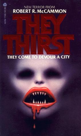
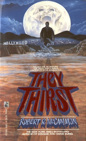
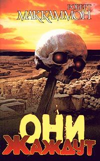
Cover A (this is the one with lips on it, yay for technicalities):
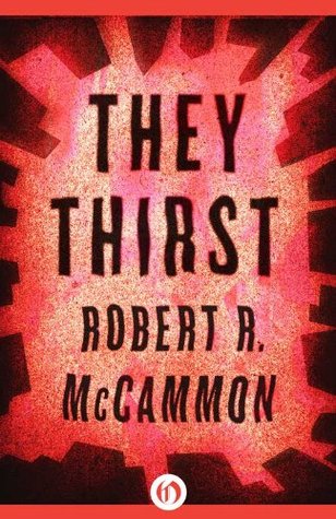
Cover B:
Cover C:
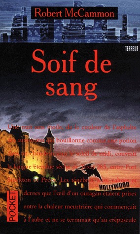
Cover D:
Cover E:

Cover F:
Cover G:
Cover H:
Cover I:
Cover J:
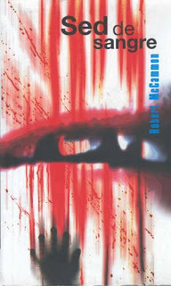
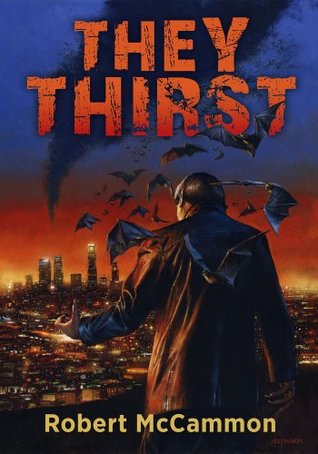
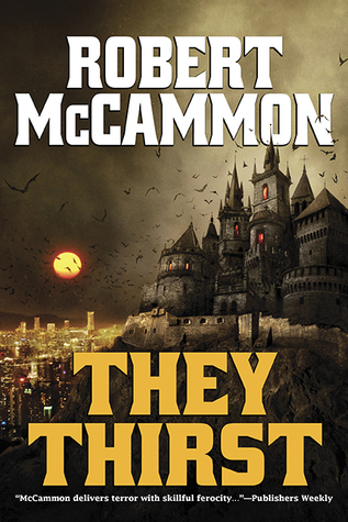
Cover G:
I really like the castle depicted in the cover along with all the bats flying around, the moon and also the big blocky font used that while it won’t be to some peoples taste, I really like it as it makes the authors and books name both stand out and pop against the image on the cover
Thoughts?? Agree?? Disagree??
Follow me on:

For once, I completely agree with you! 😜 I typically don’t pick the same covers as you for some strange reason, but I think the color scheme and layout of cover G is the one which evokes “Vampire story” the most. That said, this book has quite a diverse range of covers!
LikeLiked by 1 person
Ha, diverse is the polite way of wording that some of them are terrible! 🙂
LikeLiked by 1 person
Super terrible. I think A is actually the worst, honestly. And J… What is even going on there?! With many of these covers it’s hard to guess what the book is about.
LikeLiked by 1 person
I don’t know, I think they suffer from crappy cover syndrome, similar to how old fantasy books suffer from cheesy cover syndrome.😂
LikeLiked by 1 person
Cheesy cover syndrome is one of my favorite things! I love laughing at the over romanticized ones the most.
LikeLiked by 1 person
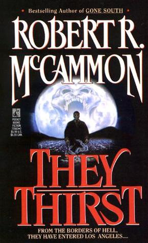
My favorites are probably B and G
LikeLiked by 1 person
I agree with this choice.. yeah I know.. shocker. But it has a more classic or traditional feel to it. That is more suiting for Vampires. I found A to be half creepy, half hilarious. It is like.. okay the face was leaning towards creepy then they slapped some Rocky Horror lips on there.. wtf? Who does that..? Dear Lord, is that a US cover, please say no.
LikeLiked by 1 person
I don’t know which covers are UK or US, some are truly terrible though.😂
LikeLiked by 1 person
I really like F for some reason. I agree with Jackie though that some are very cheesy
LikeLiked by 1 person
Lol, don’t think anyone could disagree about the cheesiness of some of the covers.😂
LikeLiked by 1 person
I agree. I like the castle on G. I also like E.
LikeLiked by 1 person
I agree as they others seem so OTT!
LikeLiked by 1 person
I agree. Cover G is the best looking one. Cover A is so creepy, by the way.
LikeLiked by 1 person
Lol, it certainly is!😂
LikeLiked by 1 person
Definitely agree with this one!
LikeLiked by 1 person
I love Cover G – the vivid colouring and the sense of menace by clever use of perspective with the blocks around the edge of the book is both eye-catching and smart.
LikeLiked by 1 person
Cover G was my favourite too – cover A is hideous isn’t it!
Lynn 😀
LikeLiked by 1 person
Ha, it certainly is atrocious!😂
LikeLike
Good pick! The other covers are just plain creepy.
LikeLiked by 1 person
They really are!😂
LikeLiked by 1 person
The first one is absolutely horrifying. Ha ha. That one would have gotten my vote!
LikeLiked by 1 person
Ha, not sure I’d have classed it as “absolutely horrifying” and more like WTF in between laughing at its terribleness.😂
LikeLiked by 1 person