

The Friday Face-Off is a meme created by Books by Proxy, where the idea is to compare the different covers of a book with each week being a certain theme.
I only occasionally do the Face-Off nowadays after creating my own 200 Words or Less Friday feature (which has been absent these last few weeks/months due to my never-ending love affair with that mistress, procrastination, though it did return last week and I will also be posting a 200 Words or Less post later today too).
The Face-Off, however, is a meme that I have always enjoyed as I find it cool to look at the various covers from different countries.
This week’s theme is: Moon “shoot for the moon. Even if you miss, you’ll land among the stars”.
My choice:
The Call of The Wild by Jack London.
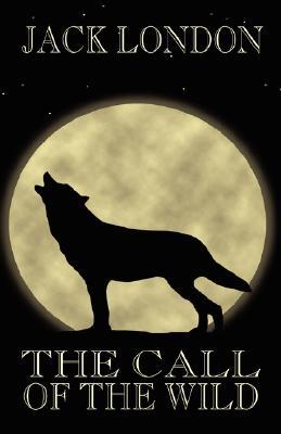
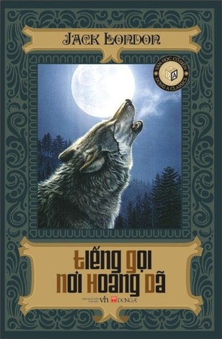
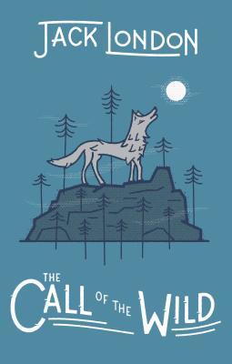
There are lots of covers and I mean lots of covers for this book, it was first published in 1903 and there are 41 pages on Goodreads for various editions!!!!
As you can see from my blog logo, yeah, no shit Sherlock I like Wolves and so this book fitted perfectly in with both the theme (moon) and my love of Wolves! If any of you haven’t bothered to look at my blog graphics because, well, some people are just plain old crazy (like the ones who don’t follow my blog, they are just silly billies) below you will see my blog logo:

See, it has a Wolf! Anyhow, onto the book covers themselves, I have chosen a variety of ten for your perusal:
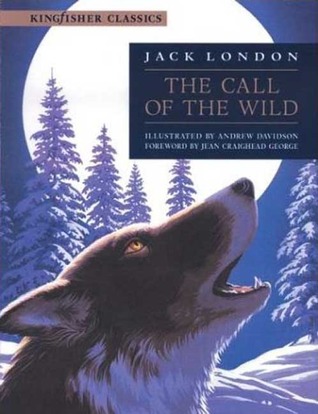


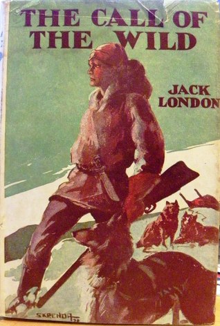


Cover C:
I just really like the overall design of this cover, it has the moon, a wolf and just looks quality to me.
Thoughts?? Agree?? Disagree??
And now before I go, here’s a different type of moon-ing!

Follow The Tattooed Book Geek on:

Oo coincidentally I was only looking at this book the other day!
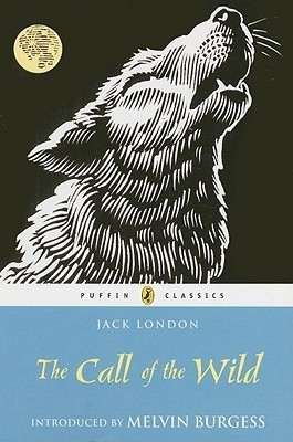
Hmm I think out of the all covers, I like the Puffin Classics one simply for the simplicity of the design. I can see why cover C was a winner for you, though. It’s an iconic image and the level of detail too! The mist from the wolf’s mouth (can’t remember the actual term for that haha) is a really small detail but adds to the effect 🙂
Also, on cover I, are those…corgis?
LikeLiked by 1 person
Mist?! Oh, you mean it’s breathe!😂
Yeah, the puffin classics cover is pretty cool too. And, I haven’t a clue about cover I though they aren’t Corgi’s, Corgi’s are what the Queen has and are short and stumpy little things but God knows, they look like no dog breed I can name on the cover!😂
LikeLiked by 1 person
Haha I know it’s its breath, I’m not that clueless 😛 I just thought that it had technical name and after a quick Google I found it’s called condensation…easier to just say breath, I think 😂
Do those dogs actually play a part in the book or did the illustrator just really not know what wolves look like!?
LikeLiked by 1 person
I haven’t a clue! It’s been years and years and years since I’ve read the book and can’t remember what really happens. I guess that dogs are involved but it’d be helpful to know what breed the dogs are supposed to be cos I don’t have a clue!😂
Ah, well, it could have been a zombie Wolf or vampire Wolf and then it wouldn’t have been its breathe!😂
Well, you learn something new everyday as I didn’t know that! I just thought condensation was the stuff that formed on windows and other surfaces.
LikeLiked by 1 person
Zombie or vampire wolves? Think that’s a pretty good writing prompt right there 😛 Perhaps someone could jump on the Pride and Prejudice and Zombies bandwagon and do a The Call of the Wild zombie mash up 😁
LikeLiked by 1 person
That was some mooning!
LikeLiked by 1 person
Ha, it sure was.😀
LikeLiked by 1 person
Hahaha brilliant! I love yor choice it’s a beautiful cover and definitely the best one. 😊
LikeLiked by 1 person
Thank you.😀 There is probably a better cover out there but no one got time to go through 41 pages of books!😂
LikeLiked by 1 person
don’t blame you 🙂
LikeLiked by 1 person
I like cover B!
LikeLiked by 1 person
I agree, cover C. And thanks for the additional moon, much appreciated 🤣
LikeLiked by 1 person
Ha, there was bound to be an additional moon in there, I like to add a bit of humour.😀
LikeLiked by 1 person
Yes, I do like cover C – I’d have gone for cover A but for the ugly chunk for the title they superimposed over the moon… But my favourite is the Wildside Press – it is simple and rather haunting – and I love the font. However, cover C is a close favourite. Great choice of book by the way…
I take it that is Bart in his natural state – after everyone has eaten his shorts…
You won’t be surprised that I’ve gone for a space theme this week:). https://sjhigbee.wordpress.com/2017/06/02/friday-faceoff-shoot-for-the-moon-even-if-you-miss-youll-land-among-the-stars/
LikeLiked by 1 person
Yeah, that chunk of a title placed over the moon really does take away from the image, it stands out far too much. The Wildside cover is pretty smart too, agree there, simple but very elegant.
Yeah, that’s Bart, one of the more decent and fun images I found when being the idiot that I am decided to type mooning into Google.😂
LikeLiked by 1 person
Reblogged this on BCSBook Reviews and News and commented:
Thanks for making my Friday morning……
LikeLiked by 1 person
Definitely C for me too
LikeLiked by 1 person
Well, you obviously have great taste!😀
LikeLiked by 1 person
Clearly lol 😁
LikeLiked by 1 person
I prefer cover A. I don’t know, it just looks nice to me. Feels nostalgic and I really like the style.
Definitely cover C for second place, though.
LikeLiked by 1 person
Cover A is pretty cool, I just wasn’t a fan of the writing being placed in a block in front of the Moon.
LikeLike
I agree with your choice. I was leaning towards cover 3 and cover 1. Have a great Friday!
-Luna 🙂
LikeLiked by 1 person
I love wolves too. I started liking wolves because White Fang which Jack London wrote. I like A and C.
LikeLiked by 1 person
Doing a buddy read with my fianceé in a few weeks: White Wolf by David Gemmel… thanks for posting. I like A
LikeLiked by 1 person
hahaha totally immature, but that Bart Simpson mooning had me laughing 😉 Agree with your choice!!
LikeLiked by 1 person
Ha, immaturity rules!😂
LikeLiked by 1 person
😂
LikeLiked by 1 person
Wow! So many covers! 😀 I think my favourite might be Cover F. That wolf is lovely. But maybe Bart should win… that is quite some moon!
LikeLiked by 1 person
I love the old-timey look of D. Love this book too. Excellent post matey.
x The Captain
LikeLiked by 1 person
Gotta go with your choice as well, I love the more realistic art style. Wish the painting could have taken up more of the cover though!
LikeLiked by 1 person
I have to give it to D on this one. I love the more dated and nostalgic feel it 🙂
LikeLiked by 1 person
Ha, you’re the only one to pick that cover.😀
LikeLiked by 1 person
😉 What can I say, I have a soft spot for that vintage look. You should see my shelves haha.
LikeLiked by 1 person
Vintage, old!😂
LikeLiked by 1 person
The simplicity of cover F draws me more than the others. This is one book I should read soon (it seemed short last time I checked the copy I had). Great pick for this feature. 😀
LikeLiked by 1 person
Thanks and yeah, it’s a short read (according to Goodreads), though I haven’t read it myself either. 😂
LikeLiked by 1 person
This was actually a close for me between C and F… C was #1 picks at first, and while I really don’t like how Puffin Classics takes up the whole lower half of the cover, but I love the way the wolf is drawn.
LikeLiked by 1 person
Very true, the Wolf on the Puffin classics is great but the whole lower half chunk of blue just ruined it for me.
LikeLike
Hmm… I’m inclided towards E… 🙂
But Bart Simpson wins of course! XD
LikeLiked by 1 person
Ha, Bart for the win, totally agree!😀
LikeLiked by 1 person
I think this was an easy choice!
LikeLiked by 1 person