

The Friday Face-Off is a new meme created by Books by Proxy, where the idea is to compare the UK and US covers of a book with each week being a certain theme, this week’s theme is a cover featuring a throne. “I sit here looking out at all I own”.
For the them this week I have chosen King of Thorns (Book 2 in The Broken Empire trilogy) by Mark Lawrence.
Cover A:

Cover B:
Cover C:

Cover D:

Cover E:

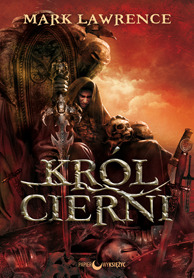
Cover F:


Cover E:
For me this is the best cover this week, I know it’s very similar to cover A and slightly similar to cover C too, however I just think the darker overall tone is smarter looking. The swords and bodies, the vibrant red cape, the throne and Jorg Ancrath himself sitting there with his head leaning on his hand, not a care in the world surveying all around him, holding a skull, kicking back, relaxing and chilling after causing all his bloody mayhem and carnage. All adds up to an awesome cover.
Thoughts?? Agree?? Disagree??
Why not join in:
Next weeks theme: 2nd Sept: Hell is empty and all the devils are here – A cover with a demon or demonic creatures.
Follow me on:
Twitter and Goodreads.

A great choice of covers, Drew! I have to say that I prefer Cover A. While the darker sky gives it a more brooding tone – I like the detail of the extra arrows and I far prefer the font of A – of course the IDEAL would be the sky in E and the extra detailing of A… Have a great week-end:)
LikeLiked by 3 people
The font on cover A is awesome. This is a popular book this week, ggrrr, must try to find an obscure book for next week! 😂
LikeLiked by 1 person
But it is so very apt:)
LikeLike
I was going to say this too. I prefer cover A, the font is what put it over the top for me. And completely agree, the ideal would be the addition of sky in E.
LikeLiked by 2 people
The font on cover A is really awesome. 😀
LikeLiked by 1 person
My preference was Cover E also.
LikeLiked by 1 person
Definitely agree with you! 😂 I almost went with A until I saw the last one. I still need to read the first book.
LikeLiked by 1 person
Yep, no need to read the second until you’ve read the first, you may not even like it, it’s far away from books with oiled abs on the cover! 😂
LikeLiked by 1 person
Ha! But you like the books with oiled abs. Won’t you miss them? 😂
LikeLiked by 1 person
Hell No, they make my eyes bleed! 😠
LikeLiked by 1 person
i think Cover A and the one you picked are all similar except for the Fonts and i like Cover A
LikeLiked by 1 person
Agree with Cover E!
LikeLiked by 1 person
I was torn between A and E, but since you selected E that was clearly the best of the two 😉
LikeLiked by 1 person
Ha, damn right! 😂👏👐😀
LikeLiked by 1 person
Definitely Cover E!!
LikeLiked by 1 person
Completely agree! Even though C is similar, it just doesn’t feel polished enough.
LikeLiked by 1 person
I like A better.
LikeLiked by 1 person
Totally agree. Great cover.
LikeLiked by 1 person
Definitely agree with you
LikeLiked by 1 person
I agree with you this time Drew 🙂
LikeLiked by 1 person
Good choice!
LikeLiked by 1 person
Yup! It’s Cover E too for me! 🙂 The colors are more vivid and the contrast between red and black is just beautiful! 🙂
LikeLiked by 1 person
I do like that choice. I’ve gone for cover A in my post but I do like the darkness in your winner. Very brooding.
Lynn 😀
LikeLiked by 1 person